Background & Challenge:
Mutts Up is a senior dog rescue non-profit that reached out to UCBerkeleyExtension for its branding needs. This potential client wanted a logo and branding identity that was cohesive and professional. The work included was a student project to build skills in branding design.
The client's main goals were to get volunteers and build a community based on education. It was also important to convey passion for dogs and the healing power of rescuing dogs.
Design Solution:
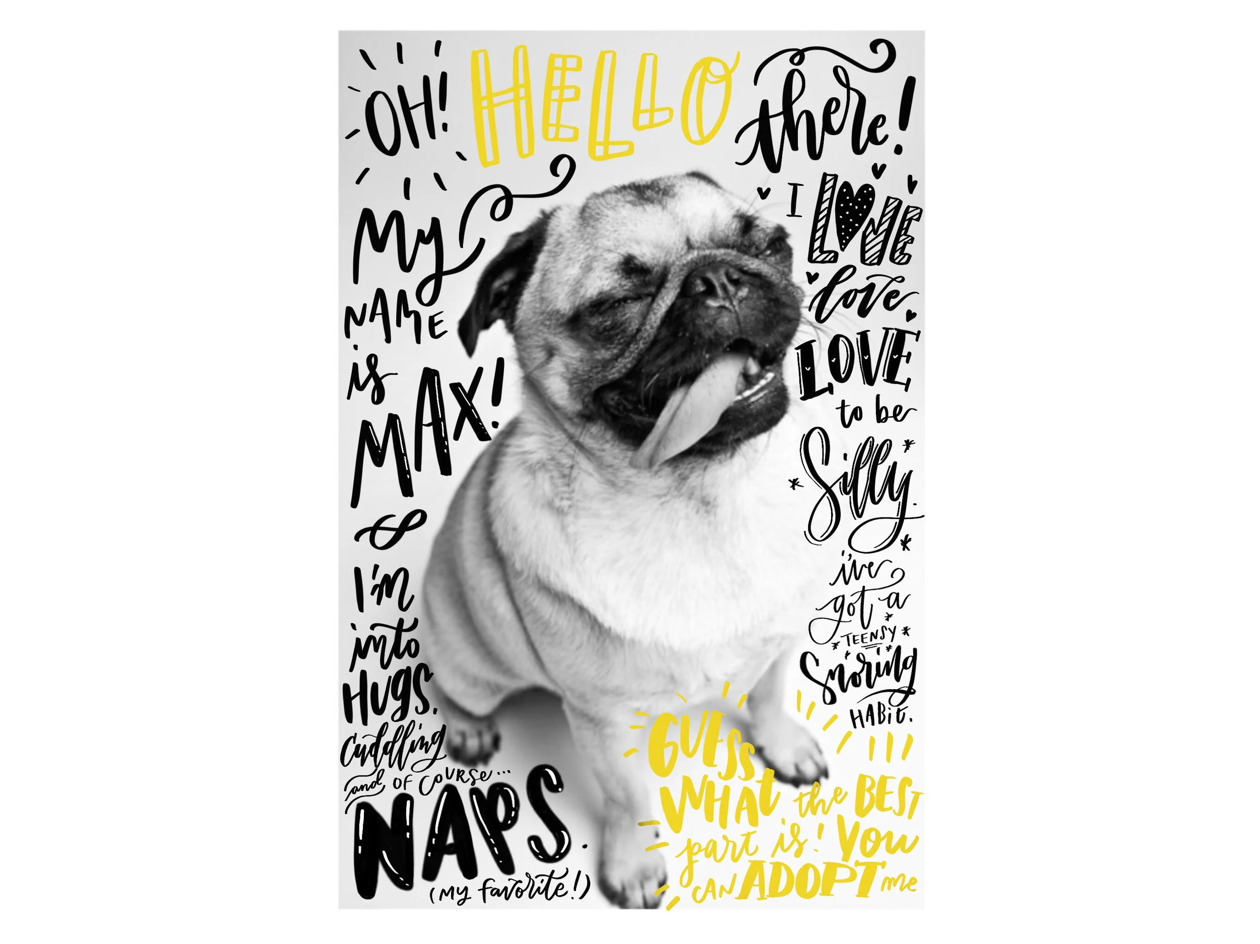
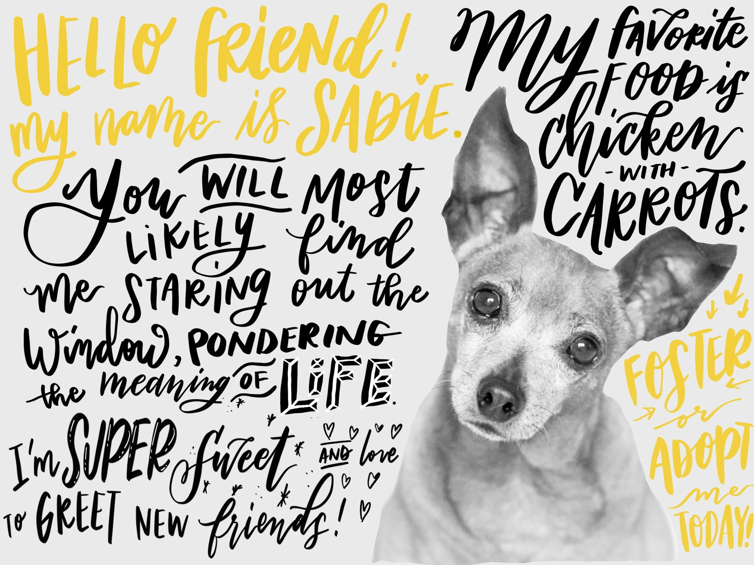
When I started research, I realized that almost all animal rescue non-profits looked serious and had various call to actions for donations and adoption. Mutts Up's story is unique in that they rescue senior dogs and the design brief from the client highlighted two main goals: passion and education. The passion of Mutts Up's founder was unlike any other animal rescue non-profit I researched, so I knew I had the opportunity to design something special for them.
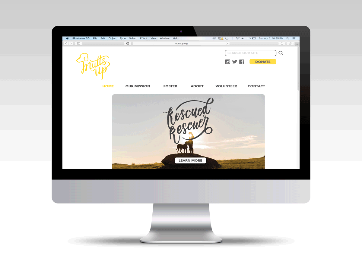
I hand lettered the logo to reflect the hands on attitude that the client had when starting his non-profit. A vibrant yellow was chosen to create a happy and joyful aesthetic that reflects the client's passion and enthusiasm towards his non-profit. I created the tagline, Rescued Rescuers, to convey the vision of Mutts Up which focuses on the mutually beneficial relationship humans and dogs share.
All print collateral designed featured typography that was connected, such as the poster, where "Leash for Life" is connected to resemble a leash. The tagline "Rescued Rescuers" on the webpage is also connected to bring attention to the mutual emotion that animal owner and dogs share.
Background & Challenge:
Black Pearl is a fictitious bubble tea and boba cafe. The target buyer is a wide range, from children to 60+, including parents who bring their young children for a treat.
Design Solution:
The company’s goals were to sell boba to customers of all ages by using fun illustrations and modern rounded type. I designed essential items that the boba cafe would need: a boba cup design, a menu, a rewards stamp card, posters, and the logo/branding choices. Finally, I designed the interior and exterior for their shop.
I used Porto Regular for the logo font and changed the cross bars of the E and A in “pearl” to a wave to create movement and follow the ocean theme. I chose to design with flat designed icons and a simple minimal aesthetic.
PYRATEA is a fictional student project that began as an assignment to create a packaging design using Adobe Illustrator.
Background & Challenge:
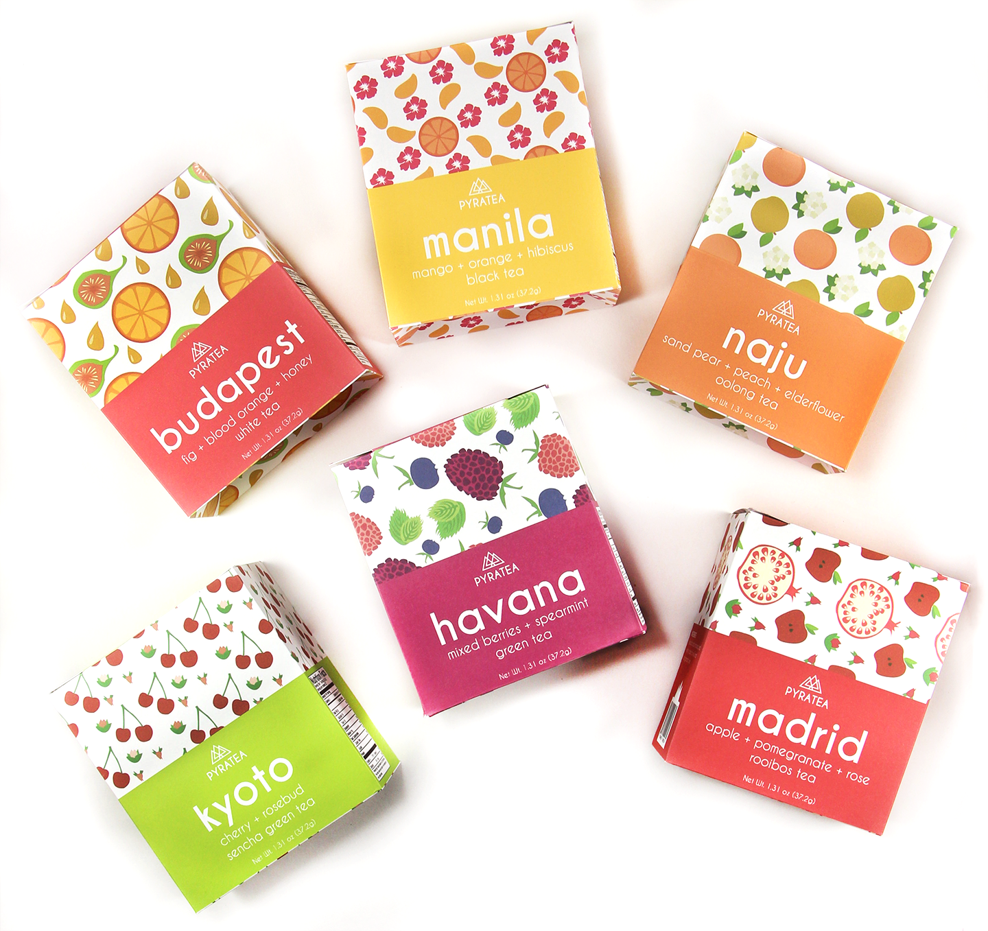
PYRATEA is a San Francisco based tea company that seeks to bring premium ingredient tea blends to young millenials. The idea is to promote wellness and holistic health in the younger generation of millenials. Ingredients are sourced from different countries, which are the star of each tea blend. This tea needed to be captivating to young energetic people aged 20-35.
Design Solution:
The solution was to use bright eye-catching colors with illustrations that clearly showed what ingredients were in each tea on the packaging. The main color is a warm minty green to reflect feelings of wellness and health. Information about caffeine and how to brew are included to educate the buyer quickly.
This concept store is web based, so I created a webpage and shop page that reflected the brand’s simplicity. Hover quick shop options allow for buyers to easily add items into their cart.
Lastly, featuring customer’s photos with hashtags of the brand sought to increase engagement with the company’s website.
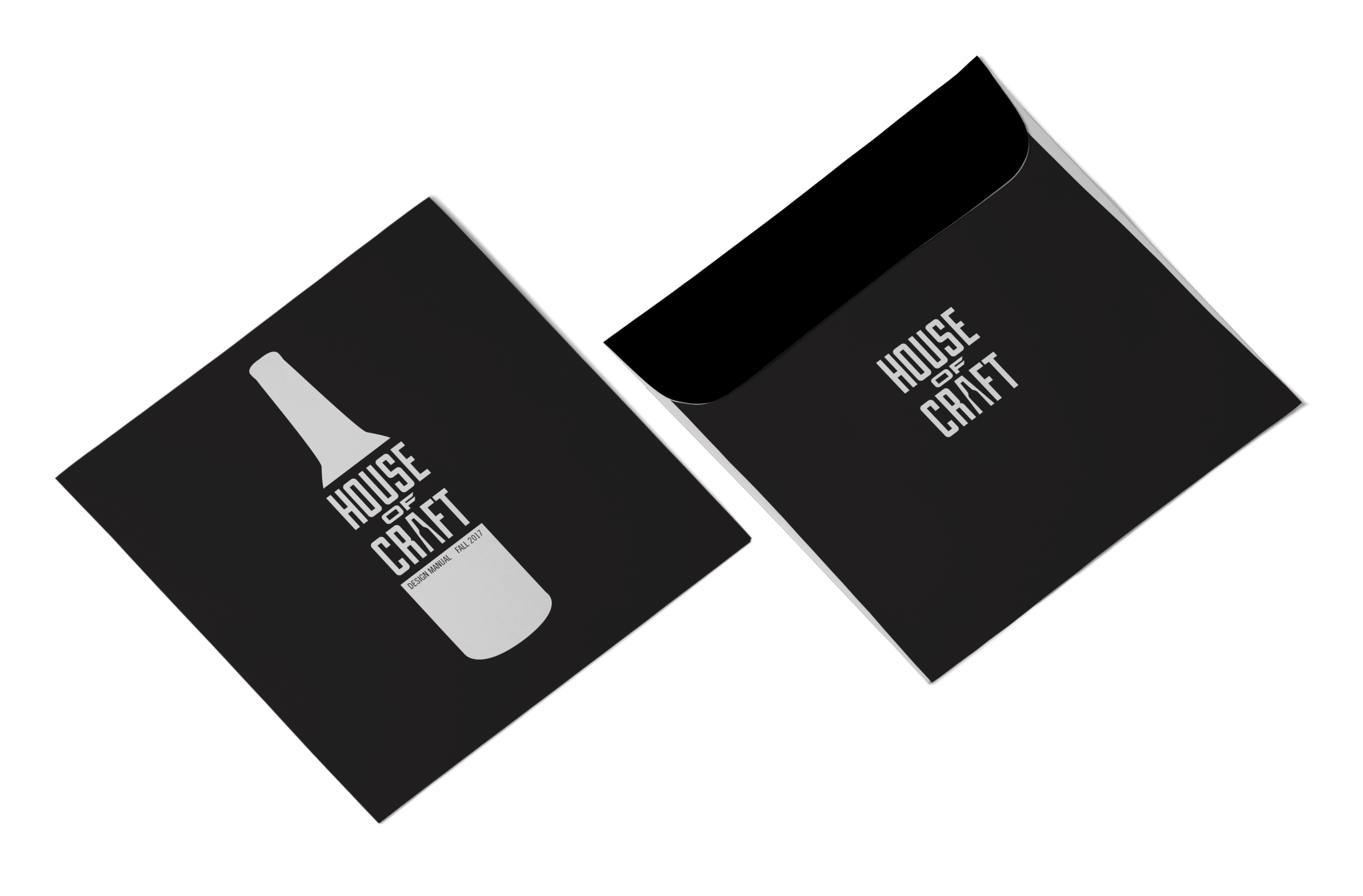
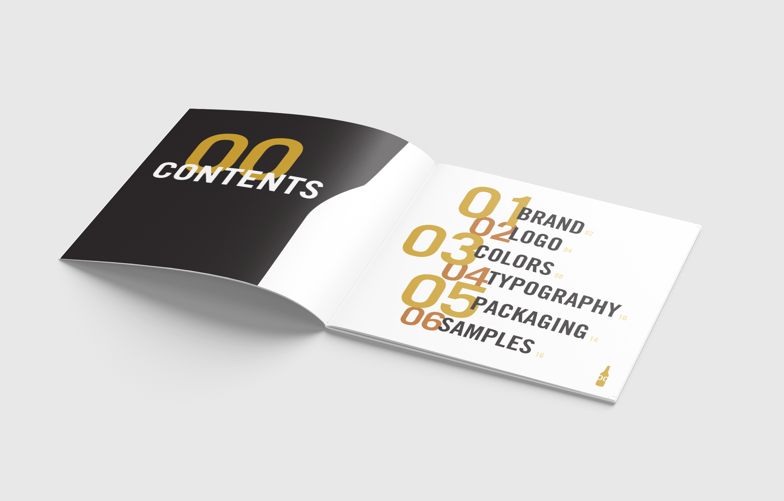
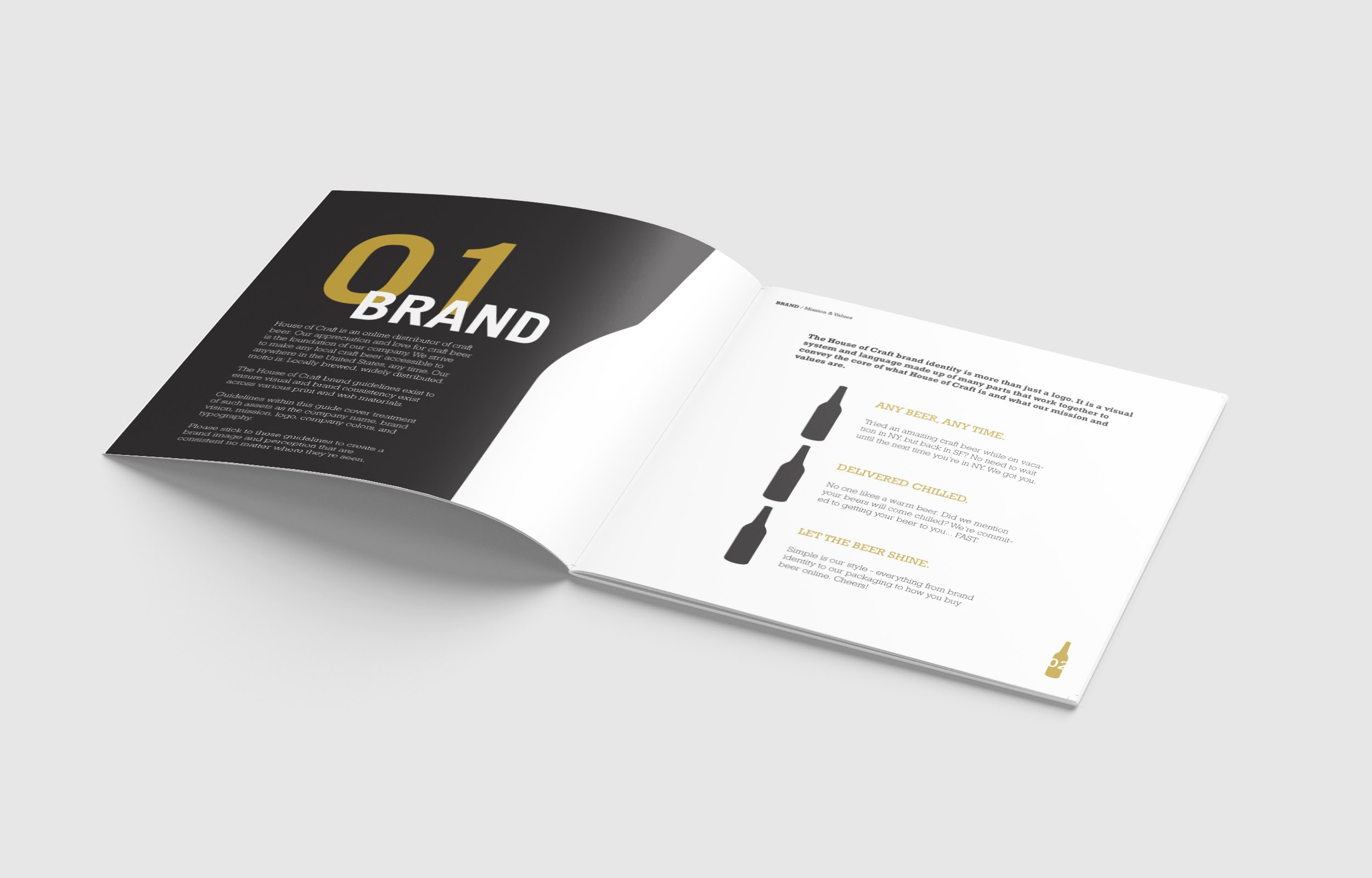
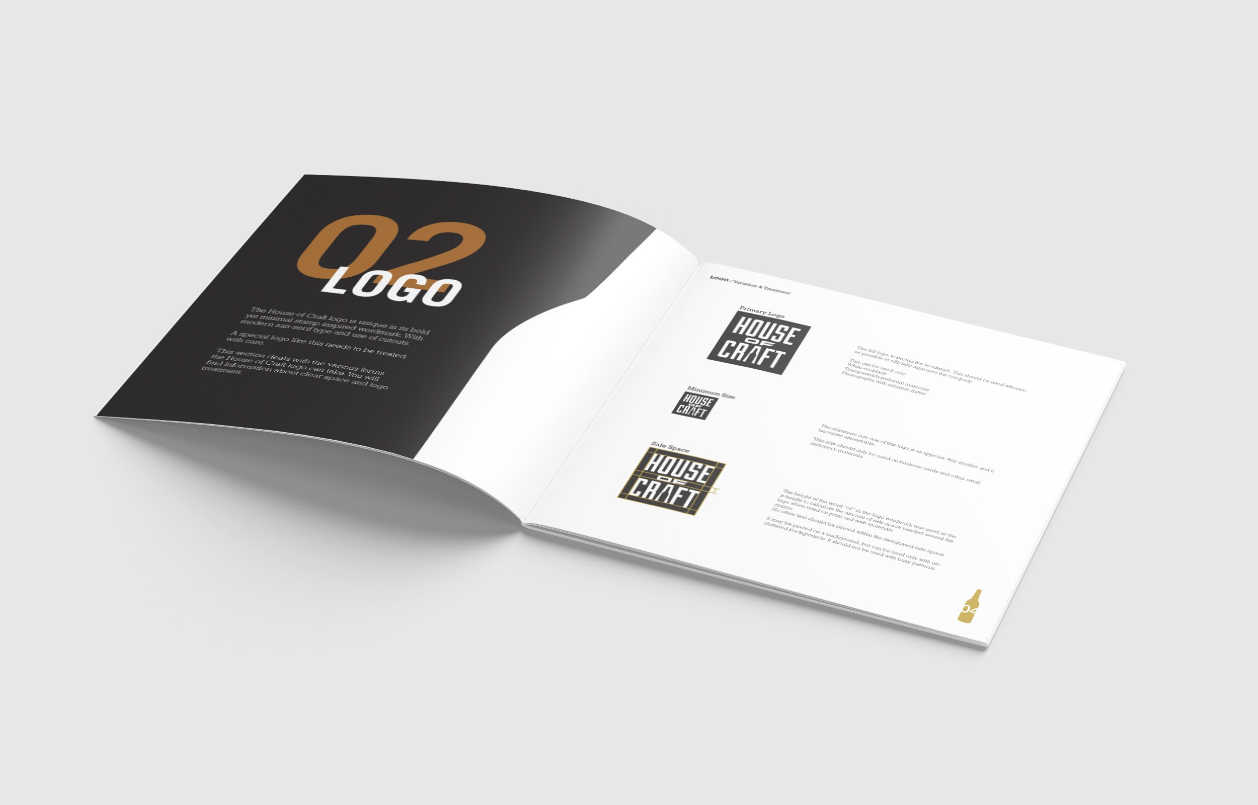
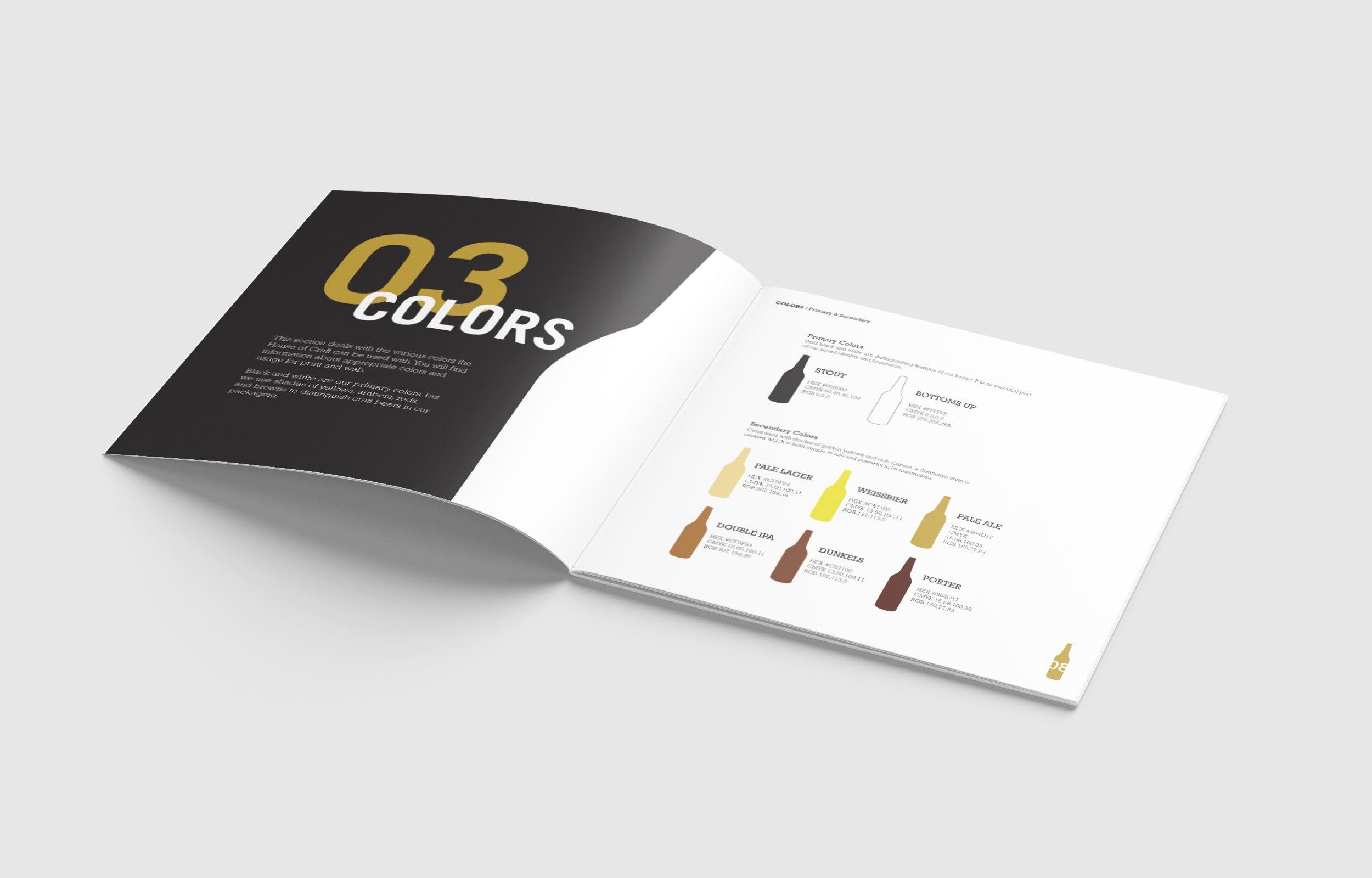
Background & Challenge:
House of Craft was a potential client who reached out to my teacher seeking a brand identity and branding collateral. It is an upcoming startup based in San Francisco. Their mission is to provide a platform where customers can purchase craft beers from anywhere in the United States. They are currently working on licensing to sell alcohol online.
Design Solution:
I created the logo with a simple but sturdy sans serif typeface to match their mission of selling craft beers. The logo needed to be contemporary, but have the stature of a classic beer house. I created a stamp like logo with a beer bottle cut out of the A to create dimensionality because House of Craft is not just a commerce site, but a delivery service too. I paired the logo with a serif typeface to pay homage to classic and vintage beer logos. The color palette was chosen to reflect the various colors of beer.
Background & Challenge:
Patchwork Show is a modern handmade festival led by Dear Handmade Life. I noticed their branding identity is not consistent across social media. I chose to redesign their logo and create some event collateral for them as a concept redesign project. Many of their flyers feature hand drawings that look more vintage than modern, and therefore do not reflect a modern maker’s festival feel.
Design Solution:
I used the same color palette as it is currently, but used them to create a fun, modern, colorful, and whimsical pattern that is used on all event collateral. It is abstract and colorful, both communicating creative and modern values, which is what Patchwork Show is about.
I created a flyer with illustrations/icons and ID cards for both vendors and staff. I also created a brochure that includes vendor information, an event map, and essential information. These are all necessary print collateral to help people find out about this event and ensure that they will easily navigate the show once they arrive.
I also focused on updating a Facebook Event Page and Instagram account with the same branding style. These are important social media pathways for Patchwork Show to keep people updated and draw both customer and vendor interest to the event. Without vendors or buyers, Patchwork Show would not be a success.
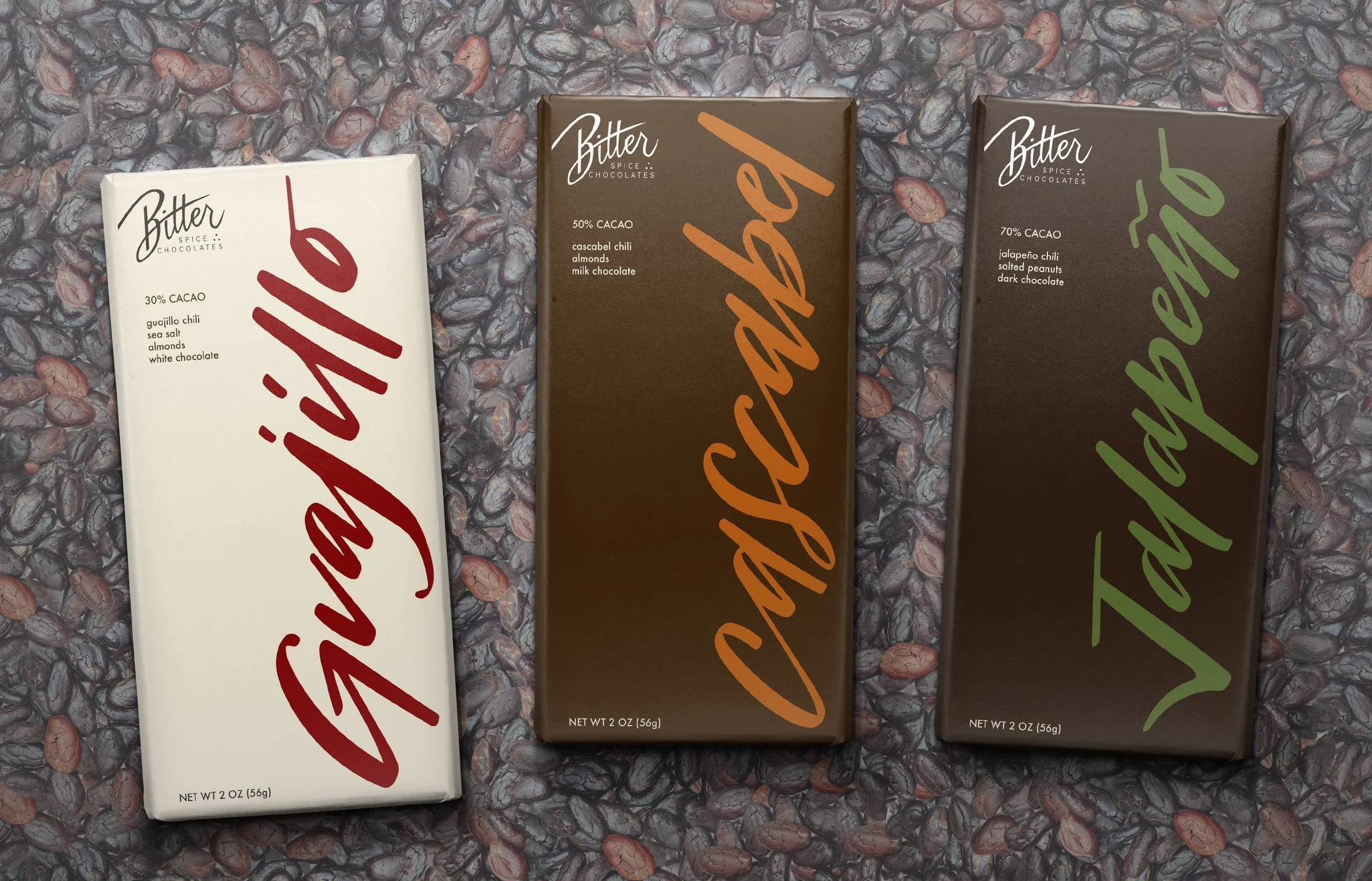
Background & Challenge:
Bitter Spice Chocolates is a fictitious company that sells artisanal chili chocolates. Its focus is on using high quality organic ingredients harvested from around the world. The founder and chocolatier, Mary Monday, travels the world to learn about the ingredients and harvests cocoa beans and chilies herself. She then uses these ingredients to create luxury chocolates in her San Francisco kitchen.
The target buyers are foodies and adventurous eaters, who seek unique flavor pairings that satisfy their sweet cravings with a kick of heat. Eating a Bitter Spice chocolate bar is an adventurous escape.
Design Solution:
Bitter Spice Chocolates needed an identity that reflected its high end, yet hand crafted chocolates. Hand lettering was used throughout the branding to achieve a modern and expensive aesthetic.
A minimal earth toned color palette of brown and olive green were chosen to reflect the purity of high quality organic ingredients in the chocolate bars.
Background & Challenge:
Little Fox is a print and paper goods store that specializes in stationery. It is a conceptual company based in San Francisco. The target audience is 20-30 year old females and stationery lovers.
Design Solution:
This idea came about from the ancient art of origami. I used qualities such as paper folding to create a branding identity in which angles and folds are dominant features. The fox head logo was created using a grid to create a geometric origami look. The slanted cut & fold is present in the store launch poster and packaging.
To prevent the branding identity from getting too rigid, I combined the geometric qualities with a softer rounded choice of typography. The result is a balanced, yet friendly stationery brand that sells fun patterned cards and journals.